Sidebar
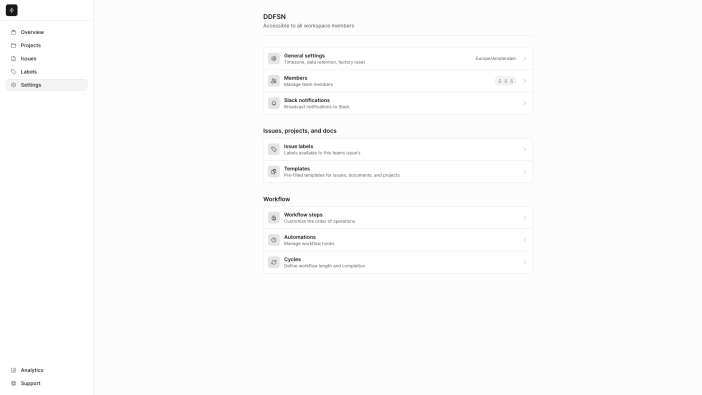
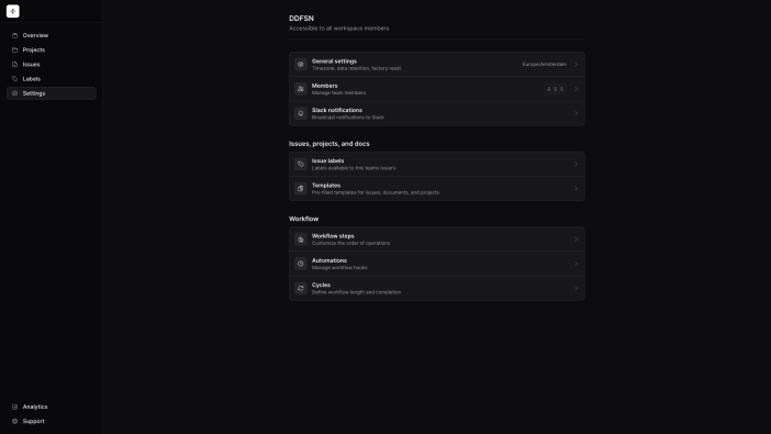
Build a two-column layout pairing a vertical navigation sidebar with a main content area. Turns into an off-canvas drawer on mobile.
Open fullscreen
Go to
<head>
    <!-- ... -->

    @ddfsnAppearance
    @ddfsnStyles
</head>
<body class="min-h-screen bg-[color-mix(in_oklab,var(--accent)_30%,var(--background))] text-[var(--foreground)] antialiased">
    <x-sidebar fixed>
        <ddfsn-sidebar-toggle class="lg:hidden">
            <x-btn
                style="ghost"
                size="icon"
                aria-label="{{ __('Close sidebar') }}">
                <x-heroicon-o-x-mark class="text-[var(--muted-foreground)]" />
            </x-btn>
        </ddfsn-sidebar-toggle>

        <nav aria-label="Main">
            <ul class="[&>li:not(:last-child)]:mb-1 [&_[data-slot=button]]:w-full [&_[data-slot=button]]:justify-start">
                <li>
                    <x-btn href="#" size="sm" style="ghost">
                        Overview
                    </x-btn>
                </li>
                <!-- ... -->
            </ul>
        </nav>

        <!-- ... -->
    </x-sidebar>

    <x-header class="lg:hidden [&>[data-slot=container]]:px-4" container="full" sticky>
        <div class="flex items-center justify-between gap-2">
            <x-sidebar-toggle class="-ml-2" />

            <x-avatar size="sm" />
        </div>
    </x-header>

    <x-main container="xl">
        <!-- ... -->
    </x-main>

    @ddfsnScripts
</body>
Secondary header
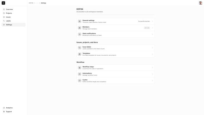
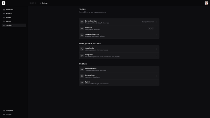
Add a secondary header within the sidebar layout for page titles, breadcrumbs, or contextual actions, sitting above your main content area beside the sidebar.
Open fullscreen
Go to
<head>
    <!-- ... -->

    @ddfsnAppearance
    @ddfsnStyles
</head>
<body class="min-h-screen bg-[color-mix(in_oklab,var(--accent)_30%,var(--background))] text-[var(--foreground)] antialiased">
    <x-sidebar fixed>
        <ddfsn-sidebar-toggle class="lg:hidden">
            <x-btn
                style="ghost"
                size="icon"
                aria-label="{{ __('Close sidebar') }}">
                <x-heroicon-o-x-mark class="text-[var(--muted-foreground)]" />
            </x-btn>
        </ddfsn-sidebar-toggle>

        <nav aria-label="Main">
            <ul class="[&>li:not(:last-child)]:mb-1 [&_[data-slot=button]]:w-full [&_[data-slot=button]]:justify-start">
                <li>
                    <x-btn href="#" size="sm" style="ghost">
                        Overview
                    </x-btn>
                </li>
                <!-- ... -->
            </ul>
        </nav>

        <!-- ... -->
    </x-sidebar>

    <x-header class="[&>[data-slot=container]]:px-4" container="full" fixed>
        <div class="flex items-center justify-between gap-2">
            <x-sidebar-toggle class="-ml-2" />

            <x-avatar size="sm" />
        </div>
    </x-header>

    <x-main container="xl">
        <!-- ... -->
    </x-main>

    @ddfsnScripts
</body>
Component API
x-sidebar
| Attribute | Default | Description |
|---|---|---|
sticky |
false |
boolWhen present, applies sticky styling to the sidebar. |
fixed |
false |
boolWhen present, applies fixed styling to the sidebar. |
x-header
| Attribute | Default | Description |
|---|---|---|
container |
null |
string || nullWhen set, adds a x-container element. Maps to the container's size attribute. |
sticky |
false |
boolWhen present, applies sticky styling to the header. |
fixed |
false |
boolWhen present, applies fixed styling to the header. |
x-main
| Attribute | Default | Description |
|---|---|---|
container |
null |
string || nullWhen set, adds a x-container element. Maps to the container's size attribute. |
x-footer
| Attribute | Default | Description |
|---|---|---|
container |
null |
string || nullWhen set, adds a x-container element. Maps to the container's size attribute. |