August 2026
Interactive layout components ship, Blade Colors becomes Blade Components, and the default theme gets a refresh.
Interactive layout components
Blade Components now ships its own layout primitives: x-header, x-sidebar, x-main, x-footer and x-sidebar-toggle. Together they cover the two layouts almost every app needs: a top navigation bar, and a sidebar that collapses into an off-canvas drawer on mobile.
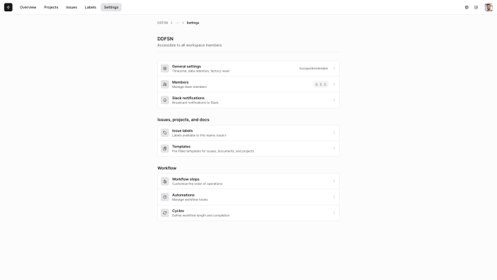
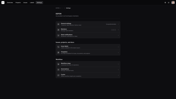
<x-header container="full" sticky>
    <div class="flex items-center justify-between gap-3">
        <x-sidebar-toggle class="lg:hidden -ml-2" />

        <div class="max-lg:hidden flex-1 flex items-center gap-4">
            <x-layout.icon icon="heroicon-o-bolt" style="primary" size="sm" />
            <nav aria-label="Main">
                <!-- ... -->
            </nav>
        </div>

        <x-avatar size="sm" src="/assets/avatar.jpeg" />
    </div>
</x-header>

<x-sidebar class="lg:hidden">
    <nav aria-label="Secondary">
        <!-- ... -->
    </nav>
</x-sidebar>

<x-main container="md">
    <!-- ... -->
</x-main>
The sidebar drawer needs a small amount of JavaScript to open and close. Add the @ddfsnScripts directive to your layout, or import dist/blade-components.js (or the ESM build) in your own bundle.
Head over to the header and sidebar documentation for the full composition, including how to combine the two into a secondary sidebar or header.
Blade Colors is now Blade Components
The distortedfusion/blade-colors package has been folded into ddfsn/blade-components and deprecated. If you were building a custom theme, two things change:
// Before
use DistortedFusion\BladeColors\Contracts\ThemeContract;
use DistortedFusion\BladeColors\Enums\ThemeVariant;

class CustomTheme implements ThemeContract
{
    public static function bladeColorDefinitions(ThemeVariant $variant): array { /* ... */ }
}

// After
use DistortedFusion\BladeComponents\Contracts\ThemeContract;
use DistortedFusion\BladeComponents\Enums\ThemeVariant;

class CustomTheme implements ThemeContract
{
    public static function definitions(ThemeVariant $variant): array { /* ... */ }
}
The ddfsnStyles directive is now also owned by Blade Components. Instead of inlining styles, it points to a dedicated /ddfsn/blade-components.css endpoint, which is automatically minified when APP_ENV is production.
The theme examples that used to ship with Blade Colors have moved to their own ddfsn/blade-component-themes package.
A refreshed default theme
The built-in theme moved off the neutral palette onto zinc, gained a softer dark background, and bumped contrast across components.
Three new ThemeVariable cases arrived alongside it: BACKDROP, HEADER_HEIGHT and SIDEBAR_WIDTH, used internally by x-sidebar-backdrop and the layout components.
Fixes
- Corrected the
Etagheader set on the binary and file responses for.jsand.cssassets, so browsers cache them correctly.